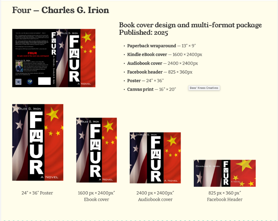
A variety of book covers and marketing materials
Non-designers often think designing a book cover means making one image. In practice, it means making one image that has to work as a 24-by-36-inch poster, a postage-stamp-sized eBook thumbnail, a perfectly square audiobook icon, and a wraparound paperback jacket with spine width calculated down to the page count. All without mangling the image or creating five different looks.
A cover has to read clearly enough to stop someone scrolling past a tiny Kindle thumbnail, but it also has to hold up printed 36 inches tall at a book signing. Type that looks bold and confident at full size can muddy at thumbnail size; detail that looks rich on a poster can vanish into noise on a phone screen. I've had covers I loved at full resolution and then had to go back and thicken a font or simplify a background because it fell apart the moment the image was made smaller.
Sometimes the format constraint becomes the whole design idea. For Charles Irion’s Four, the story hinges on a four-day countdown to a war between the U.S. and China, and the cover needed to say that before anyone read a word of copy. The solution was typographic: the word FOUR, flanked by the flags of both countries, with the ‘O’’ replaced by 四, the Chinese character for four. It's a design choice that only works because it's doing double duty as both a word and a number, in both languages, and it had to be legible as a two-inch eBook thumbnail just as much as it did on the full wraparound.
Designing a series cover brings its own version of the similar problem, the series has to be recognizable as cohesive. David Wood and Sean Ellis's Dane Maddock “Destination” series (Luxor, Sofia, Rio) needed a template sturdy enough to hold up across a different locations without looking like a separate series each time a new landmark and color palette got swapped in. The title treatment, the badge, the byline placement all had to stay locked in place so a reader could spot "Destination" on a shelf from across the room, no matter which city it was set in.
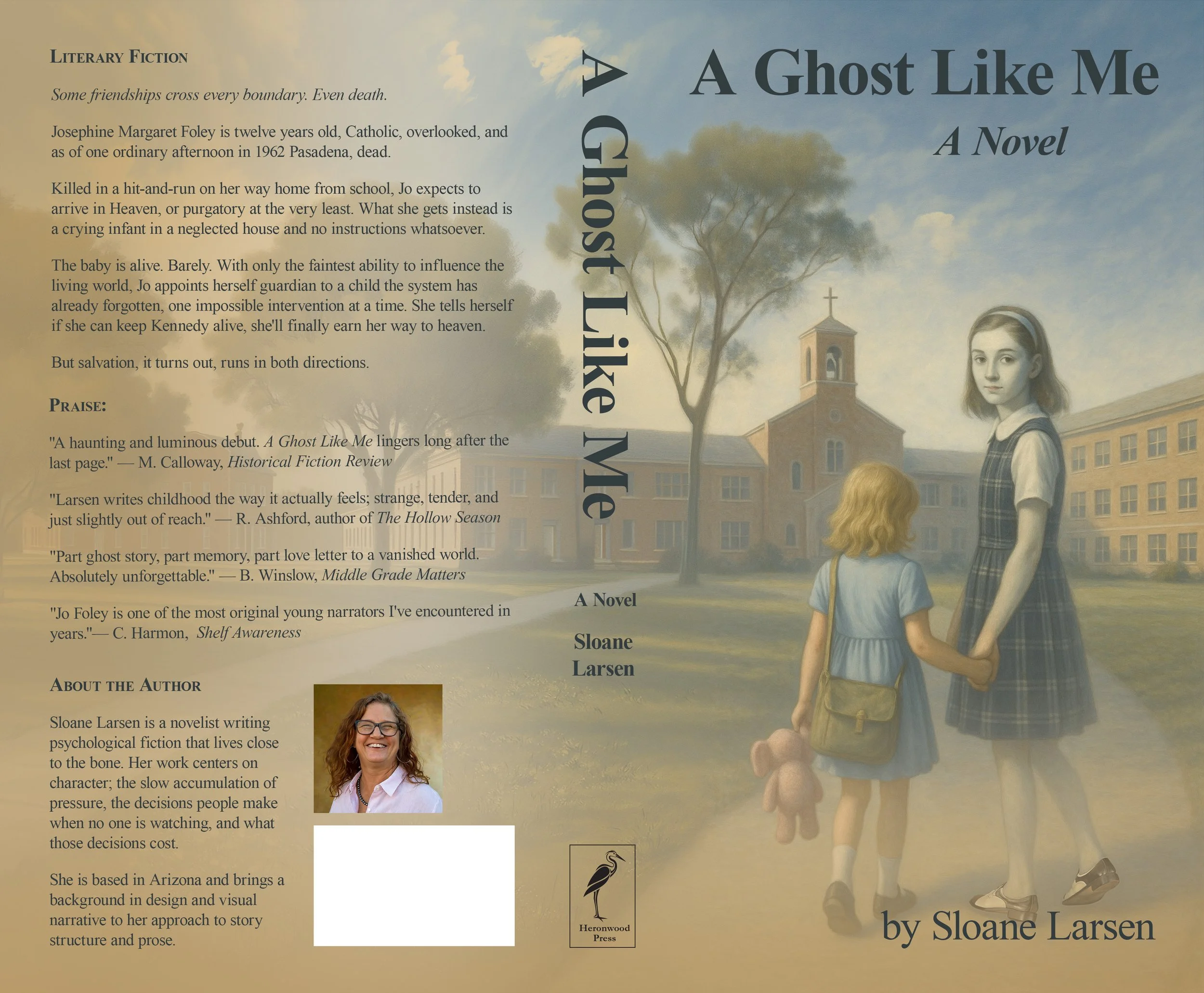
Then there's the cover where none of those constraints apply the same way. Designing A Ghost Like Me, my own novel, meant I got to sit on both sides of the desk at once, as the client and the designer. There's no franchise template to protect, no series consistency to maintain, just one cover that needed to feel quiet and literary rather than loud and adventure-genre, which meant a lot of the same instincts I use for punchy thriller covers had to go out the window entirely.
When you look at them on the portfolio page, the differences are obvious. Charles Irion's covers carry six formats each: paperback, eBook, audiobook, Facebook header, poster, canvas print. The Destination series and A Ghost Like Me needed two, a paperback and an eBook. What stays the same across every entry is the line sitting above the list, ‘Book cover design and multi-format package,’ whether that package holds two items or six. Regardless of how many formats a cover needs, each one still has to survive going from full-size down to a thumbnail and sometimes, everything in between.