Color Choices That Communicate Your Brand
By Ceci Ellis
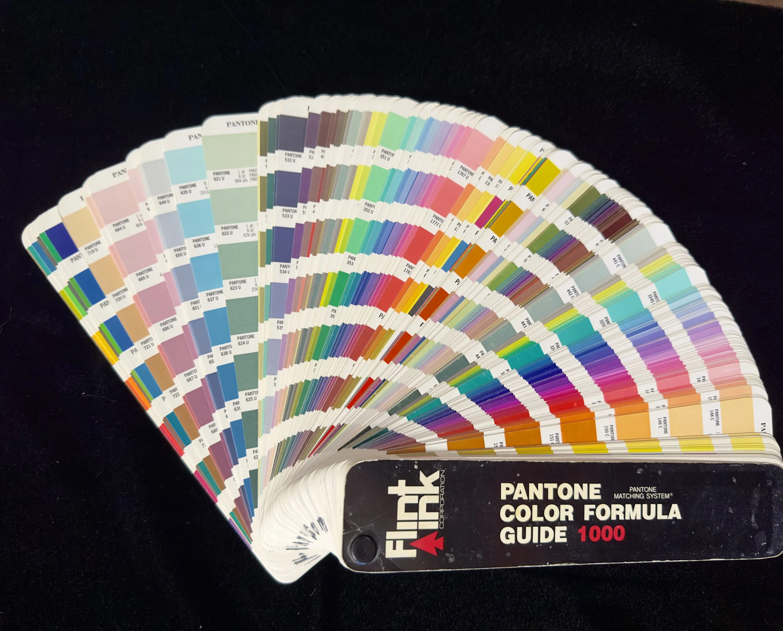
A Pantone Color Formula Guide
Every client conversation about branding eventually turns into a conversation about color, usually starting with someone saying they want their logo to be blue because blue means trust. I understand the instinct. Color psychology gets talked about like a formula: blue for trust, red for urgency, green for growth, purple for luxury, plug in the meaning you want and out comes the right hex code. In practice, it's a lot messier and a lot more interesting than that.
The research behind those associations is real, but it's softer than the infographics make it look. Culture shapes a huge amount of what a color means. White reads as clean and bridal in a lot of Western branding and as mourning in parts of East Asia. Red means danger to some people and luck and prosperity to others. Even within one culture, context does more work than the color itself. A red stop sign and a red Valentine's heart aren't communicating the same thing, and no amount of "red means urgency" explains why one makes you brake and the other makes you think about romance.
What color actually does reliably is set a tone before anyone reads a word of your copy. That's the part worth taking seriously. Someone lands on a website or spots a logo, and the color is doing its job in the first half second, well before your message has a chance to say anything. A soft, muted palette says something different than a saturated, high-contrast one, regardless of which specific colors you picked. Calm versus energetic, established versus new, serious versus playful, that's the axis color actually moves the needle on, more than any single color owning a single fixed meaning.
Where I see people get in trouble is picking a color because of what it's supposed to mean in the abstract, without checking whether it actually fits the rest of the brand. A wellness brand doesn't need green because green means health. It needs whatever palette matches how that specific business wants to feel to the people walking through the door, and sometimes that's a green, and sometimes green there reads as generic and forgettable because ten other wellness brands used the exact same reasoning to land on the exact same shade.
There's another wrinkle the color-meaning charts never account for: people have favorite colors, and those favorites drift over time. A client who loved teal five years ago might walk into a rebrand meeting wanting warm terracotta instead, not because the psychology of their business changed, but because their own taste moved on. That's a real tension in this work. A brand needs to hold steady long enough for people to actually recognize it, but the person running that brand is a human being whose favorite color this year might not be their favorite color in five. Part of my job is helping a client separate what they personally love right now from what will still serve the brand a decade from now, and those aren't always the same answer, even when the client badly wants them to be.
Contrast and legibility matter more than most clients expect going in, too. A palette can communicate exactly the right feeling and still fail completely if the text is unreadable against the background, or if two colors that felt fine as swatches turn muddy the second you put them next to each other at a small size. I've had color choices that looked great as a mood board and then had to change once they hit an actual business card or a phone screen, because what works in isolation doesn't always survive contact with the real, cluttered environments a brand actually lives in.
The palette that actually works isn't the one that ticks the most boxes on a color-meaning chart, and it isn't necessarily anyone's current favorite color either. It's the one that stays legible, stays consistent across every format you'll ever need it in, and still feels like the business every time someone sees it, whether that's on a website, a business card, or a package sitting on a shelf. Color sets the tone. Everything else you build has to actually earn it.